
UX Lead
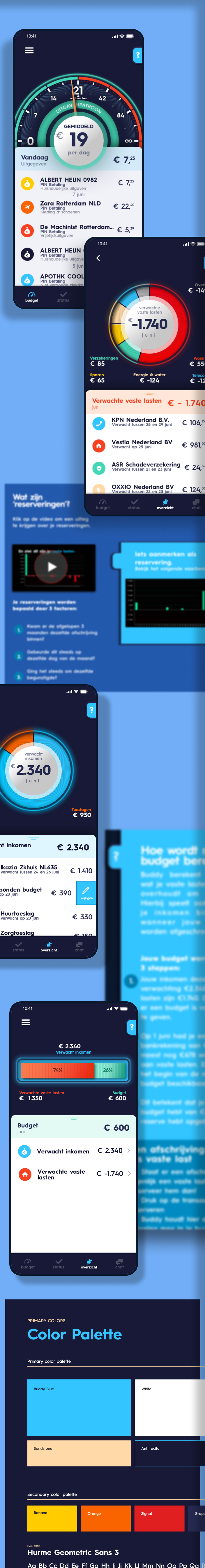
For people to stay financially healthy, Buddy had created a proof of concept that was very hard to understand. Subsequently it was not usable. I was hired to overhaul the complete UX and UI from the ground up. Together with the team we created user personas, conducted numerous interviews with bduget-experts, coaches and people using the app. The result was a completely new application did not only look better, but showed the potential what a digital financial coach actually means.
Duties
- User Research and Analysis:
- Conducting interviews and surveys with budget coaches, experts, and end-users.
- Analyzing pain points, needs, and behaviors through personas and user journey mapping.
- Organizing user testing sessions for feedback.
- Strategy and Planning:
- Defining the UX strategy aligned with business goals and user needs.
- Prioritizing features and creating a UX/UI development roadmap.
- Executing a content strategy for user engagement.
- Design Execution:
- Crafting wireframes and prototypes for UI visualization.
- Designing intuitive and accessible UI elements.
- Developing a responsive design for various devices.
- Collaboration and Communication:
- Working with financial experts to integrate knowledge into app design.
- Collaborating with developers for technical feasibility of designs.
- Updating stakeholders and integrating feedback.
- Design System and Standards:
- Creating or updating a design system for visual consistency.
- Establishing UI guidelines and best practices.
- Documentation and Handoff:
- Documenting design decisions and research findings.
- Preparing design specifications for the development team.
Tools
- Sketch
- Axure Pro
- Adobe Photoshop
Collaboration
- JIRA
- Slack
Results
As a UX Lead for the Buddy app, the focus on a user-centric design approach led to several tangible outcomes:
- Enhanced User Understanding:
Comprehensive research methods provided deep insights into user behavior, preferences, and challenges, resulting in a product that truly resonates with the target audience.
- Strategic UX Alignment:
The developed UX strategy successfully aligned the product with business objectives while addressing the users' needs, paving the way for a well-received market entry.
- Intuitive Design Implementation:
Wireframes and prototypes evolved into a sophisticated UI, marked by its ease of use, leading to a seamless user experience across various devices and platforms.
- Effective Collaborative Processes:
Cross-functional collaboration fostered an environment where design and development teams worked cohesively, ensuring a smooth transition from concept to functional product.
- Consistent Visual Language:
The establishment of a comprehensive design system promoted a consistent look and feel throughout the app, enhancing brand recognition and user trust.
- Detailed Documentation:
Exhaustive documentation and clear design specifications streamlined the development process, reducing time to market and ensuring fidelity to the envisioned user experience.