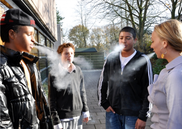
No one was born a smoker.
Over the last century, people’s habits have changed a lot. Technology has also contributed to the changes in consumer preference as their dependence on technology has moved them to do everything online including changing their habits.
Pretty much every one starts smoking as a result of their social environment: be it their peers, friends, parents or role-models.
Why not use the same environment to stop smoking?


In a nutshell
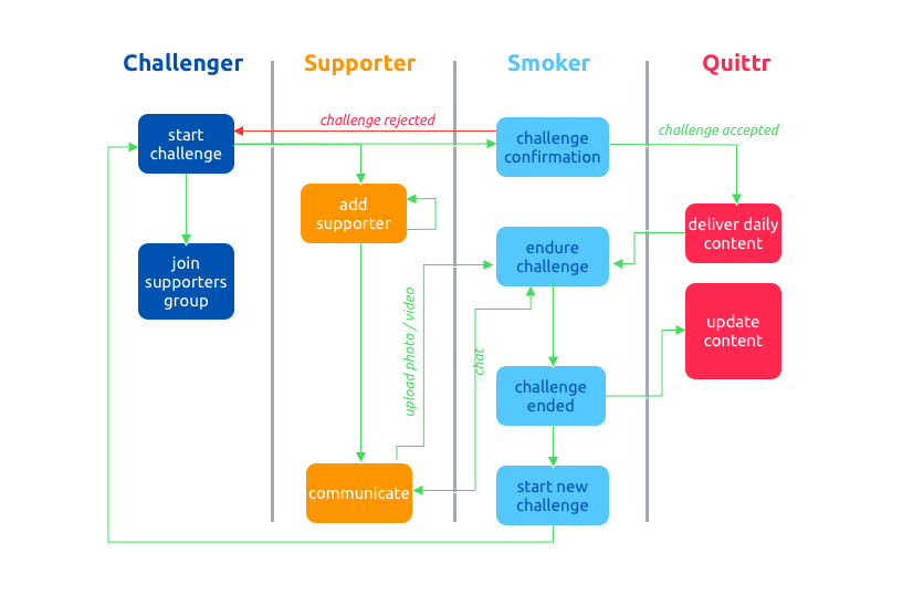
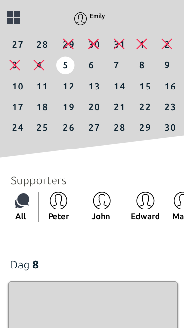
Design a system that uses an app to engage the social network of a person who wants to stop smoking (the ‘quitter’) to achieve a goal: 28 days of not smoking. The idea is simple:
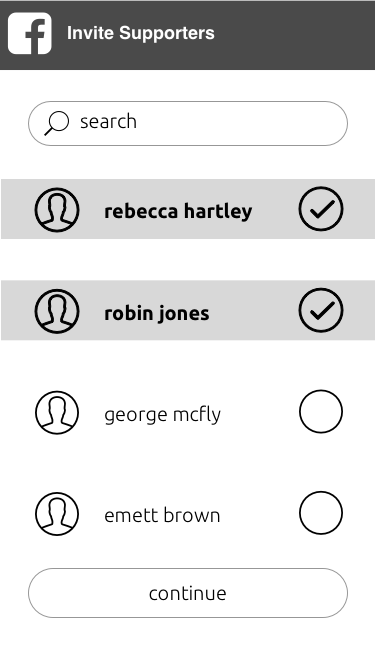
- A challenger invites someone to stop smoking
- A group of supporters help the smoker to accept and achieve the goal.
- In return they vouch to pay for a return-favour.
- During the challenge the smoker will receive content to stay away from smoking.
- A new challenge is started by the quitter.
Business Strategy Diagram
To get a better understanding I made a small Business Strategy Diagram
Task
Create UI/UX for both Mobile App and the Dashboard to support the system.
Problem Definition
The mobile app is the vehicle to distribute the platform. The strength enventually is to gather as much anonymous data on behaviour as possible to make the platform more useful in the future. This means tailored content towards both the person trying to stop smoking as well as the supporters group. A distinctive feature of the application is a single design, user-friendly interface.
On top of that the dashboards supporting the platform should be informative and give the user the correct tools to deliver the correct content to the user, as well as being able to provide A-B testing purposes.
I just love dashboards...
Since my study Automotive Technology i just loved dashboards as they are a vital part of the information the driver is getting whilst on the road.
I have designed many of them. Not only for information purposes, but also as a management console for controlling software-systems.
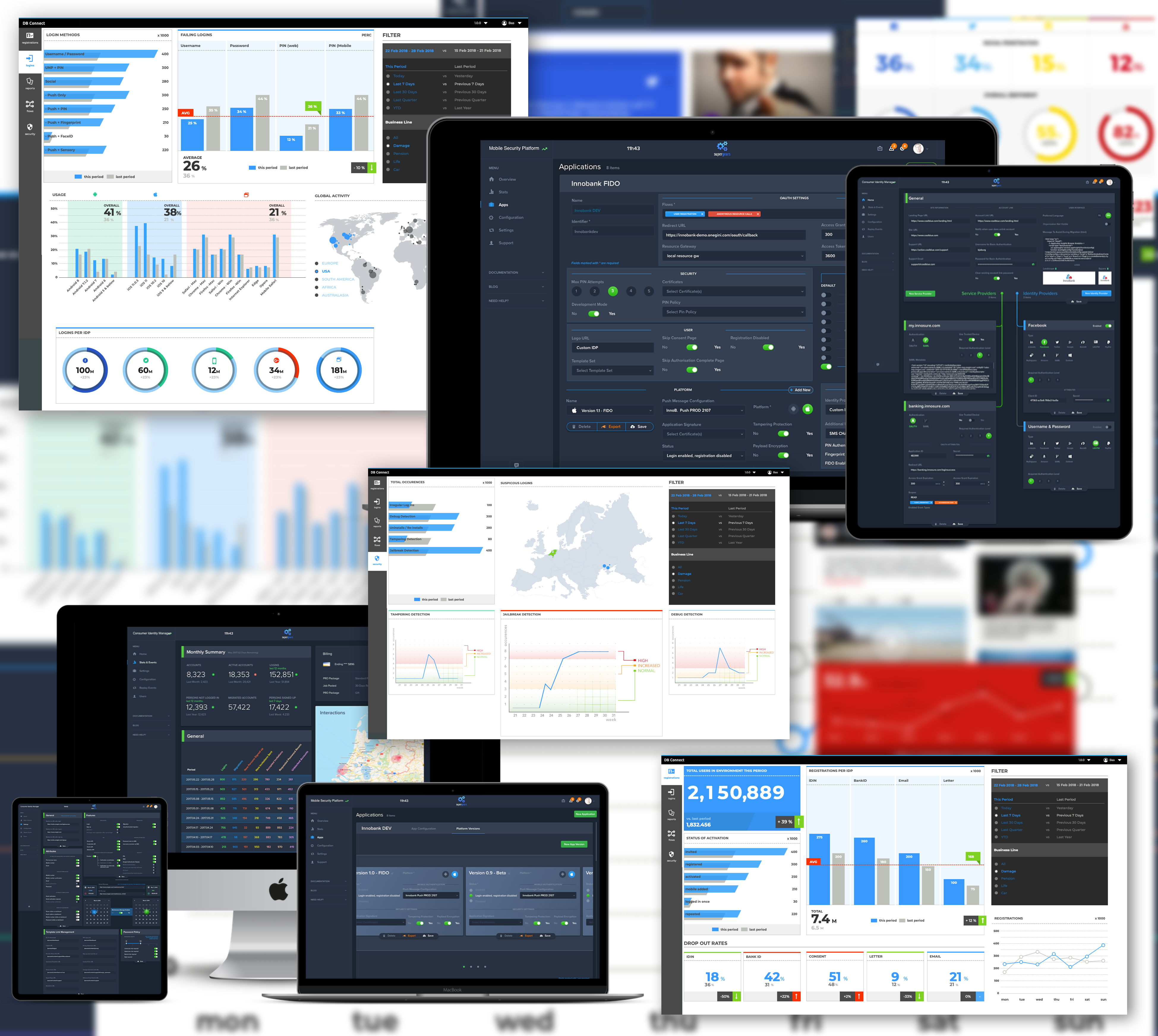
The Quittr Dashboard
Although a Dashboard can be pretty straightforward as it comes to interaction, to determine what to show (and when), is not. When a dashboard is done right, people wonder how they ever lived without it.
A proper-designed dashboard is a starting point for your analyzes. Armed with the same powerful collection of information, your business makes faster decisions based on a single source of truth.
The message and stats of a great dashboard are clear, colour enhances meaning, and all the information you need is at your fingertips. So how do you build dashboards that deliver on this promise and are right for your organization?
It actually boils down to three things:
- Thoughtful planning
- Well thought out design
- A critical eye for what stays and what goes
Interaction Design and Wireframing
As we are not designing for the mass audience, we skipped the steps creating user personas. This did not mean however that we did not design this with the user in mind. As there would be more than 1 role using the system, smart filters based on the permissions would need to be there. Also, as the whole system is brand new, the CSC's (Critical Success Factors) would start out to be pretty basic, namely Success Ratio (i.e. did the person actually achieve the goal of not smoking). Based on these CSC's the main interest were:
- What is the size of the supporters group ?
- What are the social media channels of inviting new supporters and smokers?
- App downloads and installs
- Generic metrics (load times)
- Social Activity
Secondary would be Distribution of the app, as well as reports on Succes Rates and Overview.
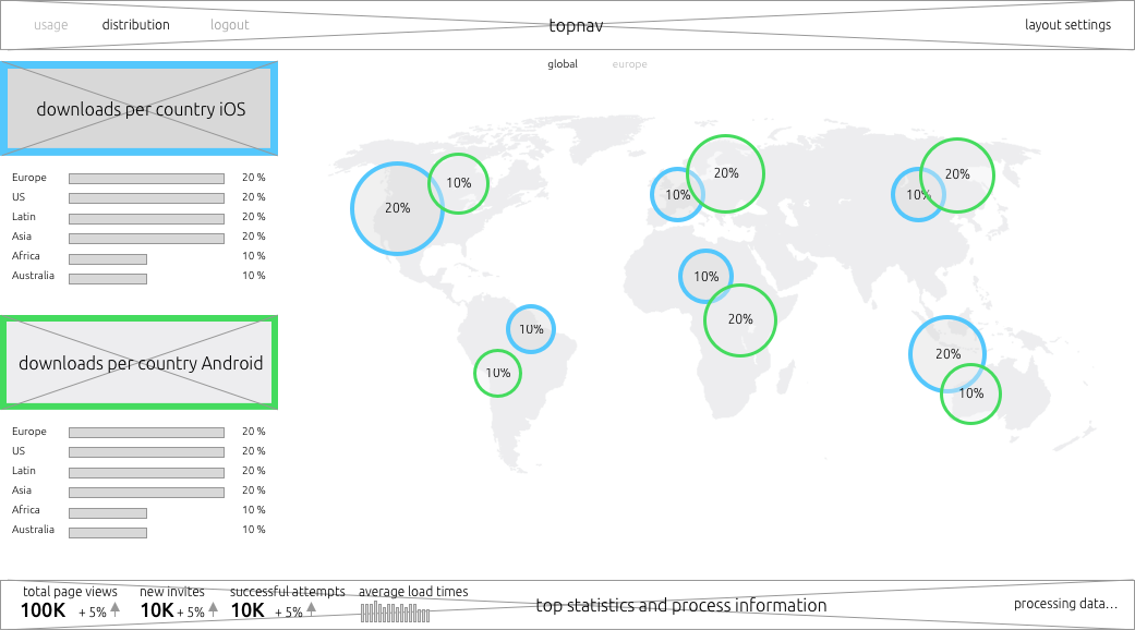
Wireframe - Usage
The Usage Dashboard would have widgets that can be configured. Also, generic Top Statistics in the bottom would always be available.
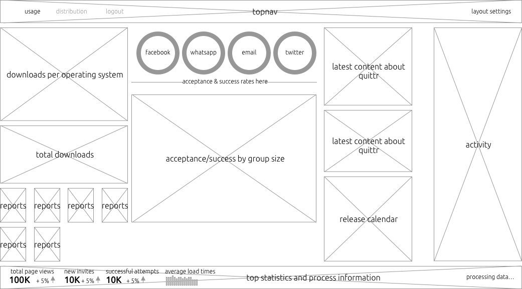
Wireframe - Distribution
The Distribution of the app per operating system is divided into Global and European maps. The european map also has a distribution by version.
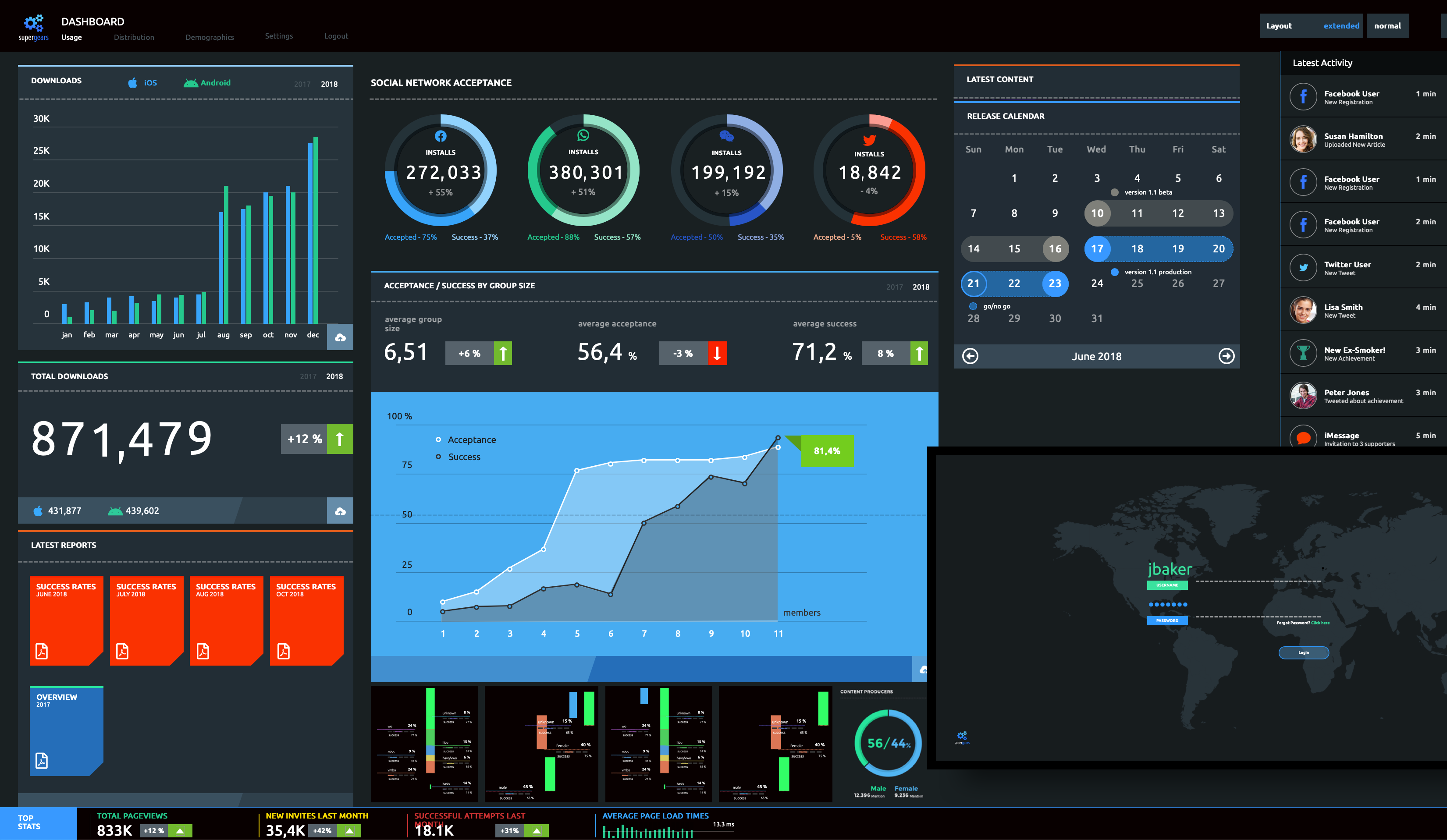
The result
The usage dashboard with all widgets expanded can be quite a lot to chew on for a user. That is why we chose to make all widgets collapsable and configurable.
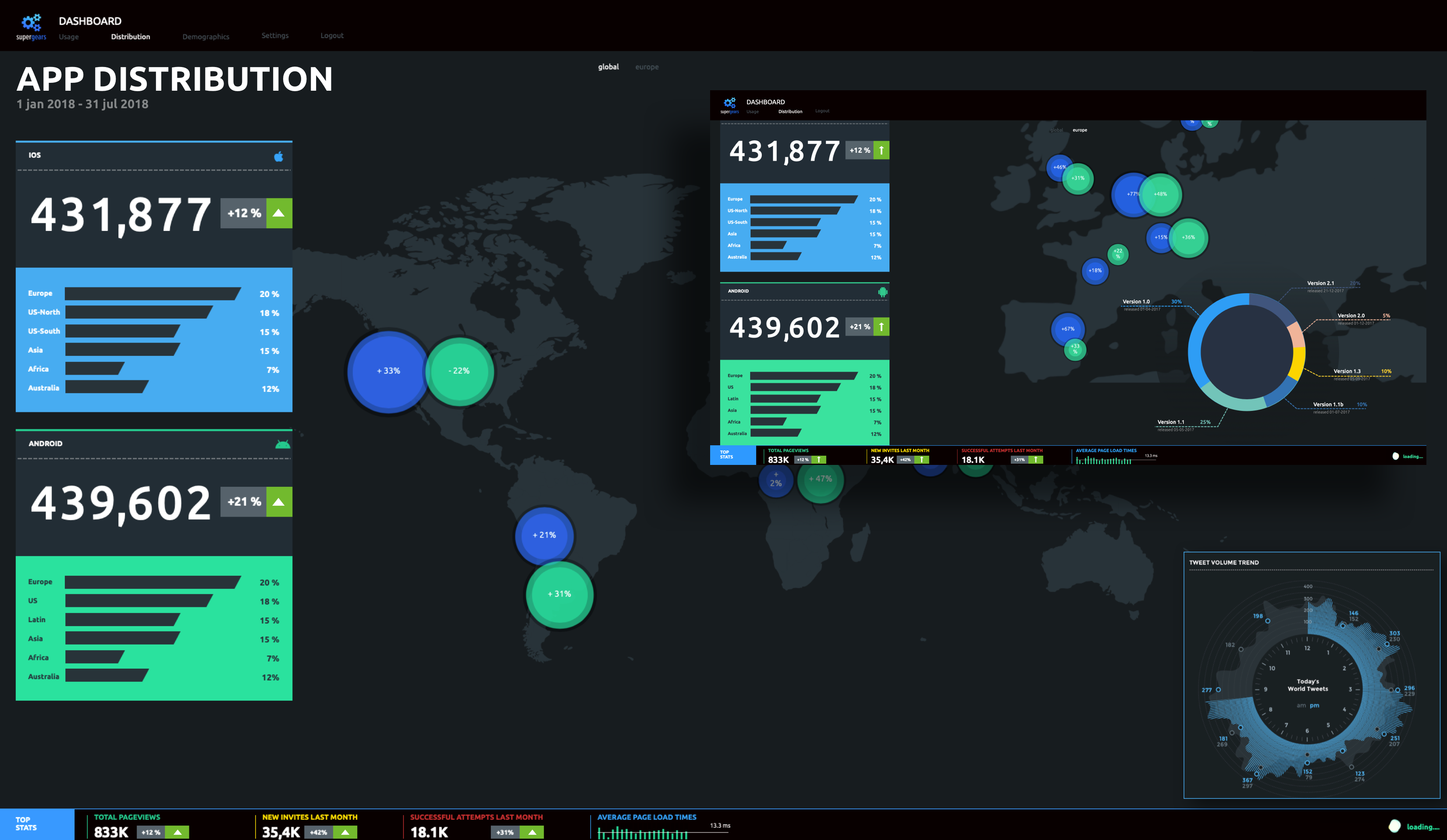
Distribution
The distribution page has fewer widgets as it gives an overview only. We also played around with a widget that shows usage per 24 hours (hence the circular distribution. In the end it turned out to be too much work for the amount of information provided.
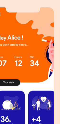
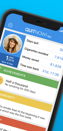
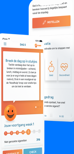
The Mobile App
The mobile app for iOS and Android obliged us to use a more thorough approach as the success will eventually be measured by the usage of it. I followed a specific process to come to a desirable outcome for all stakeholders.
Process
I’ve started the process with competitive research and I identified top three competitors. Analyzing and comparing the content of their apps helped me to determine the direction of development for the Quittr App.
Main take away
All apps focus on 2 things: health (duh) and money saved. It is our believe that although you want to save your life and your money, when it comes to additiction you need other support.
These intrinsic motivations (health and finance) will NOT help you through the
difficult periods as it the gratification (having some money to spend, and not dying) come way later than the joy of a cigarette NOW.
That is why Quittr focusses on support by others!
Personas
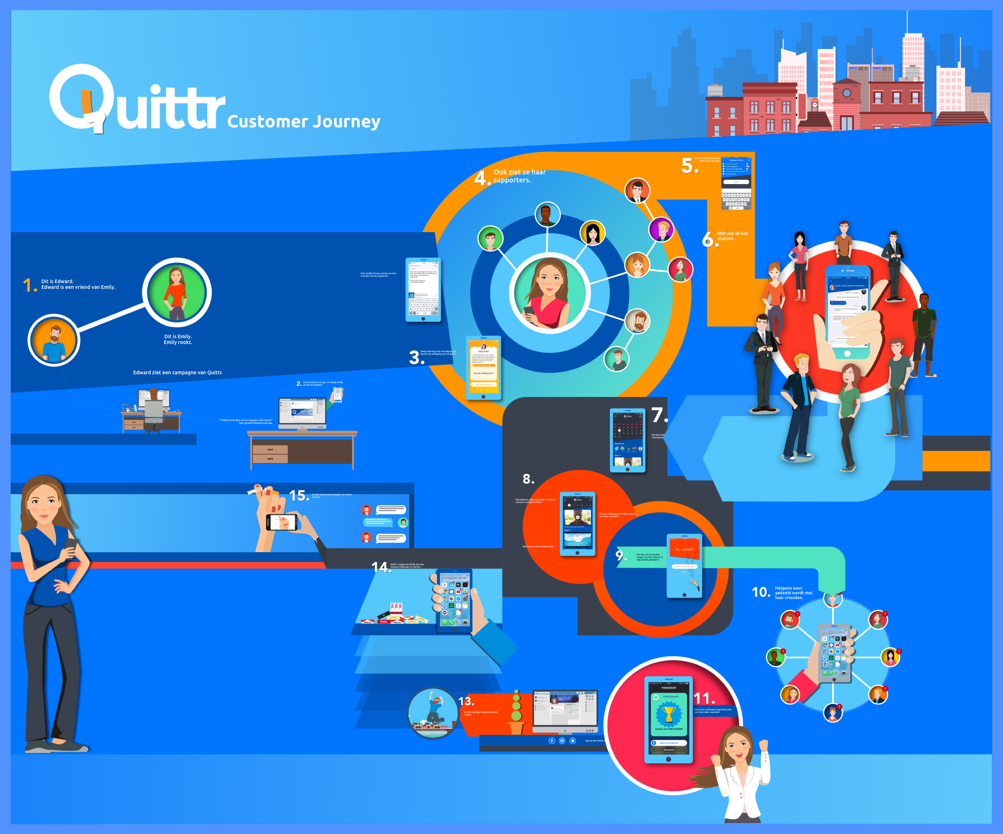
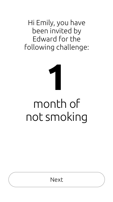
Further, to build empathy with users, I started off with a set of casual interviews. This resulted in a preliminary set of requirements and creating User Personas. Although we ended up with a set of 12 personas, 2 personas are the most important ones:
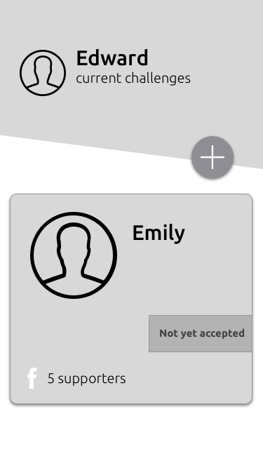
- Emily, the smoker (and hence the quitter)
- Edward, the challenger (and supporter)
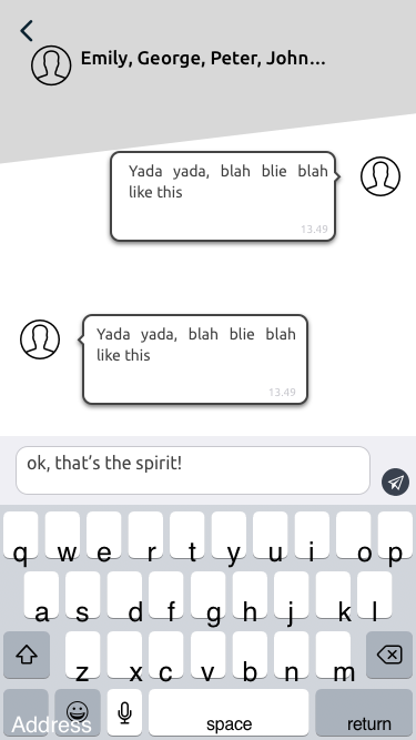
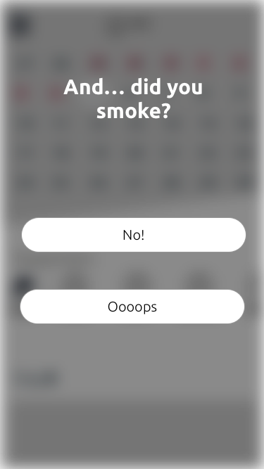
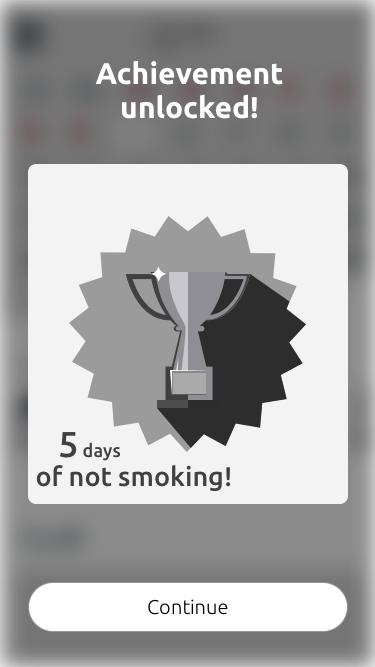
In order to place the whole system in the right context we build Customer Journeys, one of which can be seen here.
Unique Selling Points
These interviews also gave me the most important features, or Unique Selling Points our app should have (in random order):
- No or little registration
- Free of charge
- Easy to share
- Friendly (so no shaming)
- No emphasis on money saved, but on achieving the goal of becoming a non-smoker
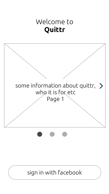
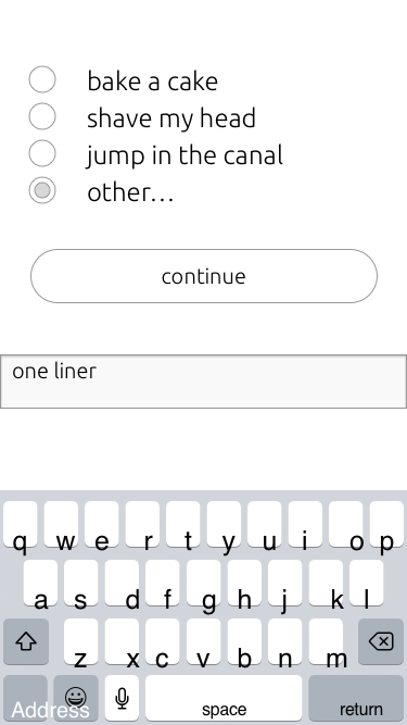
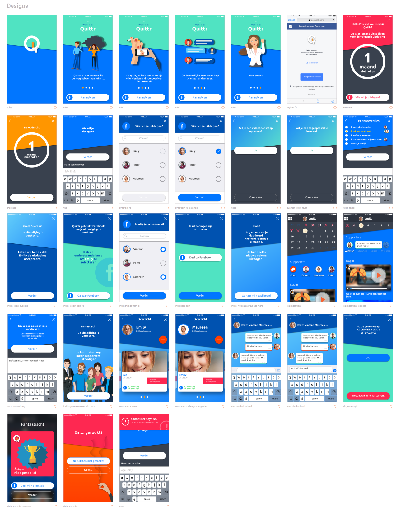
Wireframes
We used wireframes early in the development process to establish the basic structure of an app before adding visual design and content. In the ideation phase I created wireframes that present the information architecture of the future layout.
UI Design
Choosing colours for design, in general, is not easy. So why notjust choose colours for our projects based on how we feel about them or based on the trends? I’ve become more aware that knowing colour theory, preferences and background of the client, a culture of users and comprehension of your audience and competitors is the best way to choose the right colour for your project. Researching the competition is the best way to avoid unintentional plagiarism. It will give you an idea of common colour threads that run through the other companies (whether they’re using correct colours or not) and it will show you what kind of direction to avoid to ensure that you don’t create something identical.
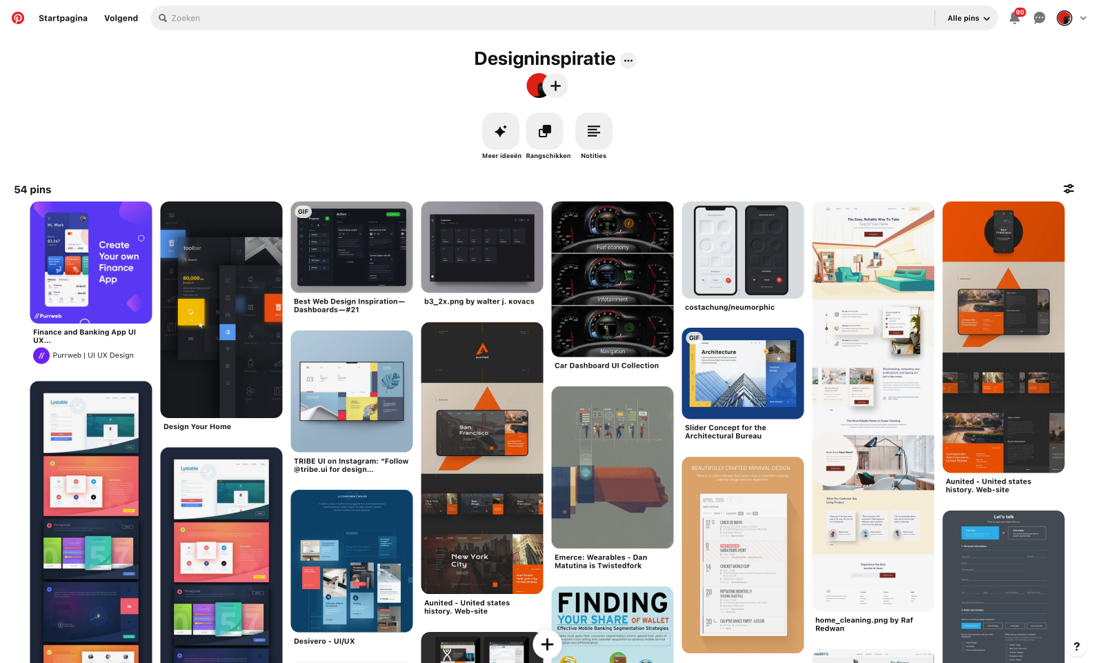
Pinterest is my playground
Pinterest, Dribble, Behance are just a few sites I get my inspiration from. I made a few boards and keep on visiting them, replacing them, adding new ones, until I have enough ideas. Even during design I keep on looking at them. Although Pinterest is larded with annoying and destracting adverts (we UXers are distracting by anything that moves, I guess) it is still my main source of inspiration.
Choosing colours for designs, in general, is a difficult task. So why not just doing an analysis of colours, their perception and influence. Orange is a warm colour. Creating an atmosphere of warmth and friendliness, you can safely choose orange. In addition, orange can add feelings of confidence and vitality, as well as stimulate the appetite. Orange should be used for products and services that are designed for a wide audience. Next to that we created a whol set of friendly colours and gradients.
Mood Boards
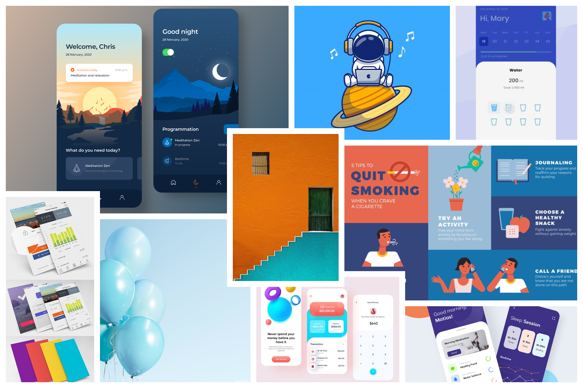
Finally, after all researches and analysis, we focused on designing the screens through which all user personas will move, and created the visual elements, and their interactive properties, that facilitates these movements. I used things like patterns, spacing and colour to guide the user and designed visual, interactive elements that respond well and feels natural to any user.
Current State
As we speak the app is being built but we already have a working prototype. Please contact me for more information.